Sleep Dies Young
PROXY DIVER
EP COVER & ANIMATED VISUAL
Brief: the feeling of derealisation
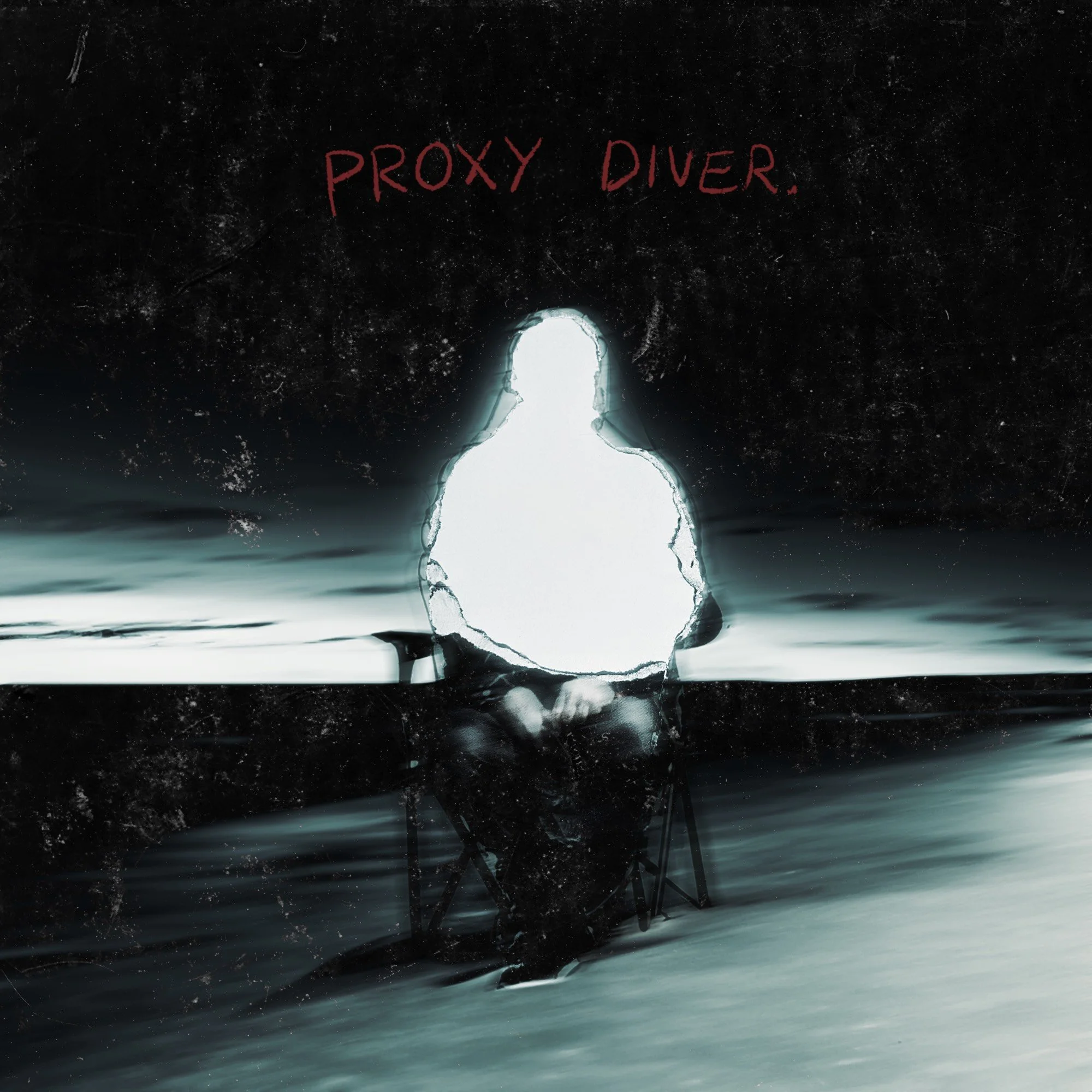
The Cover: This was originally supposed to be a cover only for the single, ‘Mortem’. Mortem was one of my favourite demo’s I’d ever received. It was this tired, defeated sounding grungey shoegaze that made me feel like I was sinking into myself. It felt like sitting on a dark beach, waiting for the tide to wash over you and pull you into nothingness. I went through a few ideas, but this EP cover came to me like a vision. It was simply meant to be.
The Visual: I liked the idea of the subject becoming part it’s surroundings. Something into nothing. Taking a figure barely holding onto it’s humanity as it is, and letting it completely disintegrate & become reclaimed by the ocean. The chair peels away and the legs crumble as the waves consume them. The upper half of the body fades away into the sky. It’s almost that feeling of thinking you might’ve seen something - someone - only to look back and find a vaguely human arrangement of shapes.


The Process: A combination of handcraft and digital manipulation.
This process was extremely emotionally driven. It was really cloudy & rainy here in Queensland for a long time, and I remember listening to the demo tape while looking out at the seemingly eternal storm on the horizon. I was inspired by the darkness of the water, and the deep connection I felt to the song. I realised the story was something anyone could place themselves in. The subject needed to be faceless, representing the feeling of being here but not here, and giving the listener the opportunity to insert themselves into the story.
The idea clicked very suddenly. I remember thinking ‘I need to find a picture of a guy sitting in a chair in a field’. What are the chances? I found one in an old skate mag I’ve been hauling around for about 4 years. Like I said, meant to be.